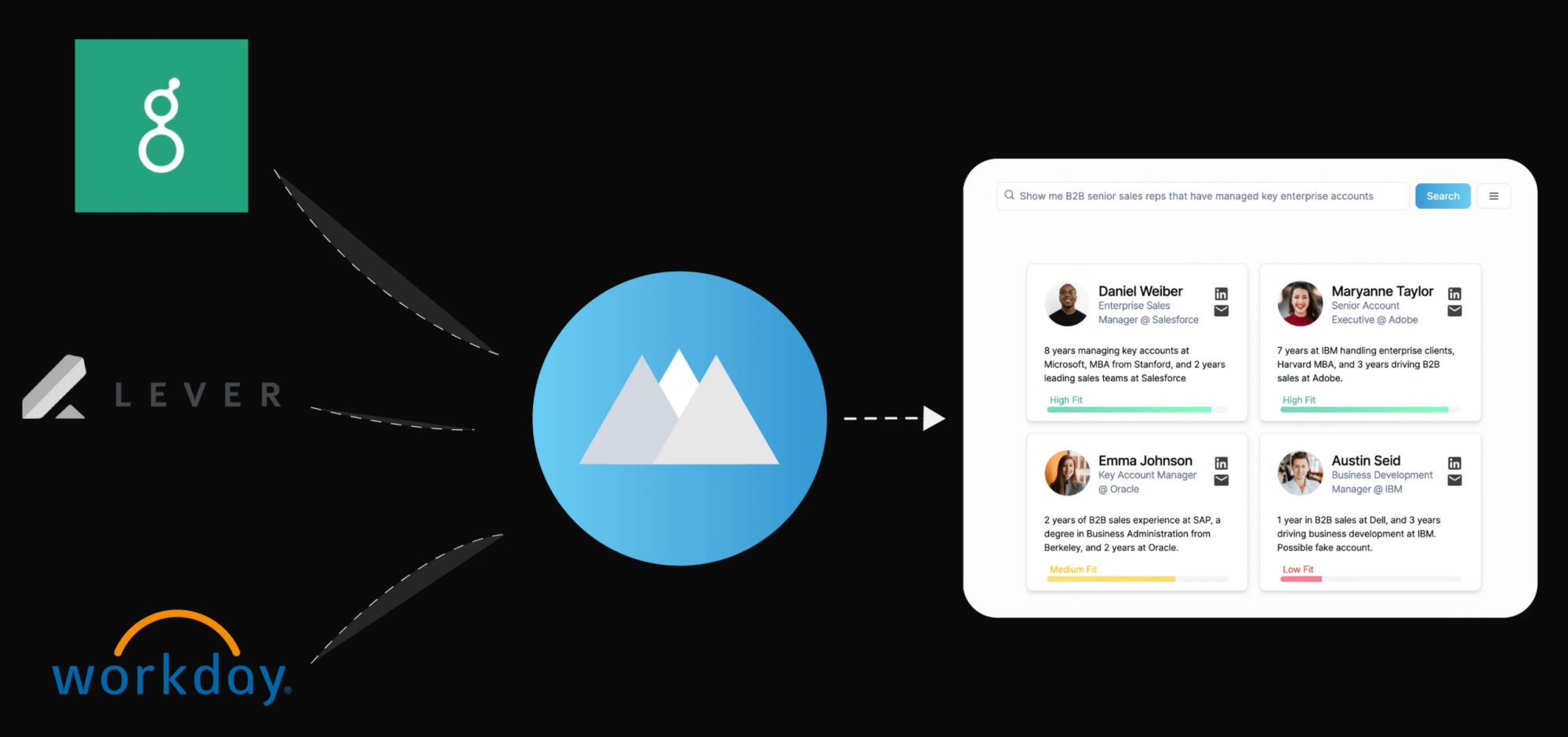
I love the copy they're using for their headline.
Describing Serra as a "search engine for recruiters" immediately helps me understand the product.
To make this even better they should add a visual because our brains process images much faster than text.
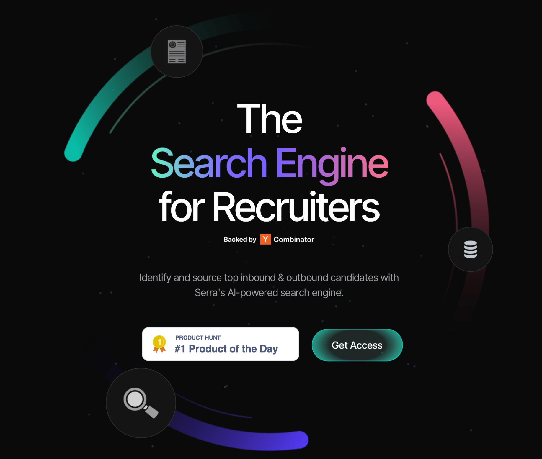
I definitely don’t love the CTAs.
The first button should be a badge. Why would you want to send people away after all the effort you've put into getting them to land on your site?
The second button could be more specific. Is there a free plan? A free trial? Not knowing this adds unnecessary friction.