Was this newsletter forwarded to you? Sign up to get it in your inbox.
I’ll start where it started: Gmail, midnight, me looking up from the fluorescent screen to the sky outside my window—dark but open, a few thin clouds drifting past the treetops, the kind of depth that reminds you there’s air beyond the glass. By contrast, the inbox on my screen looked like a lab: white tiles, hard light, rows of cells, sterile and devoid of life.
For Cora, the AI-enabled email assistant we’re building at Every, we wanted more of what was outside my window and less of what was glowing on my screen: Outside air, inside the app. I took the idea to Midjourney: skies, oil-paint textures, soft depth—the kind of details that add up to a place where you want to spend time.
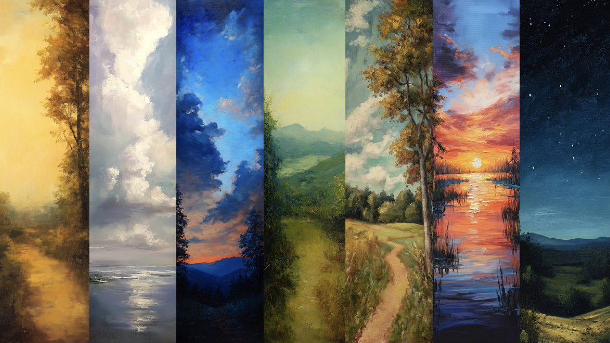
The first images we generated looked perfect in Figma: highly detailed oil-paintings, impressionist brushwork, all in 4k image quality. In production, it fell apart. The more emails the user had, though, the bigger their Cora Brief became, and the more the background stretched and pixelated. We needed 8k, sometimes 10k-pixel resolution just to maintain the painting’s integrity. Each image iteration grew heavier and heavier. We were generating images with heights over 18k pixels. Pages would’ve taken eons to load.
From an engineering perspective, it made no sense. You don’t use a massive image for a background when you can’t predict page height, because if everyone is getting a different view of the image, you can’t guarantee a coherent experience. Our approach violated other “best practices” of product design, too: You don’t add texture when flat colors load instantly. You don’t choose paintings over flat backdrops when you’re building software that needs to work on every connection speed.
But we weren’t just building software. We were building a place.
We talk about online places as spaces—Slack channels are “rooms,” Twitter a “public square”—but we don’t really think of them that way, and we even less design them that way. Even the apps we don’t label as spaces, like Gmail, are sometimes rooms we inhabit for hours of our day. Most of them feel like conference rooms under fluorescent lights. Functional? Yes. Somewhere you want to be? No.
We solved the engineering for our painted-sky backgrounds. More importantly, we discovered something: Art direction is product architecture. It makes trade-offs clearer, keeps the experience coherent, and gives people a reason to choose your product in a world where AI can generate the median in seconds.
Make your team AI‑native
Scattered tools slow teams down. Every Teams gives your whole organization full access to Every and our AI apps—Sparkle to organize files, Spiral to write well, Cora to manage email, and Monologue for smart dictation—plus our daily newsletter, subscriber‑only livestreams, Discord, and course discounts. One subscription to keep your company at the AI frontier. Trusted by 200+ AI-native companies—including The Browser Company, Portola, and Stainless.
The gravity of sameness
Open any design gallery—Dribbble, Behance, wherever designers show their best—and squint. Dashboards blur: rounded corners, neutral grays, tidy rows of cards. Landing pages collapse into one rhythm: hero text left, image right, three features below. We got so good at a certain kind of design, and that kind of design is so effective, that the outcome looks nearly identical across the web.
With good reason: Style guides gave teams shared rules to follow. Design systems turned those rules into reusable patterns. Utility frameworks like Tailwind made those patterns shippable in code. Each step improved access and reliability, but it also narrowed the expressive range. When teams reach for the same components, apply the same spacing scale, and follow the same accessibility guidelines (as we should), differentiation becomes a deliberate fight against defaults.
Now add AI. Ask a model to “design a SaaS dashboard” and it returns the statistical median: sidebar navigation, metric cards, data table. Competent, functional, and forgettable. As AI-built interfaces become tomorrow’s training data, the effect compounds. The median tightens. The web accelerates toward a single, hyper-optimized, bloodless template.
When sameness costs nothing, difference carries the value. If two products solve a problem equally well, people choose the one that feels better to use—-the tone of voice that resonates, the design that delights, the experience that feels lighter or more focused. Think about writing in Word versus Google Docs: Both let you draft this article, but Docs wins for a million small reasons—cleaner interface, snappier feel, less clutter. Those subtle differences add up.
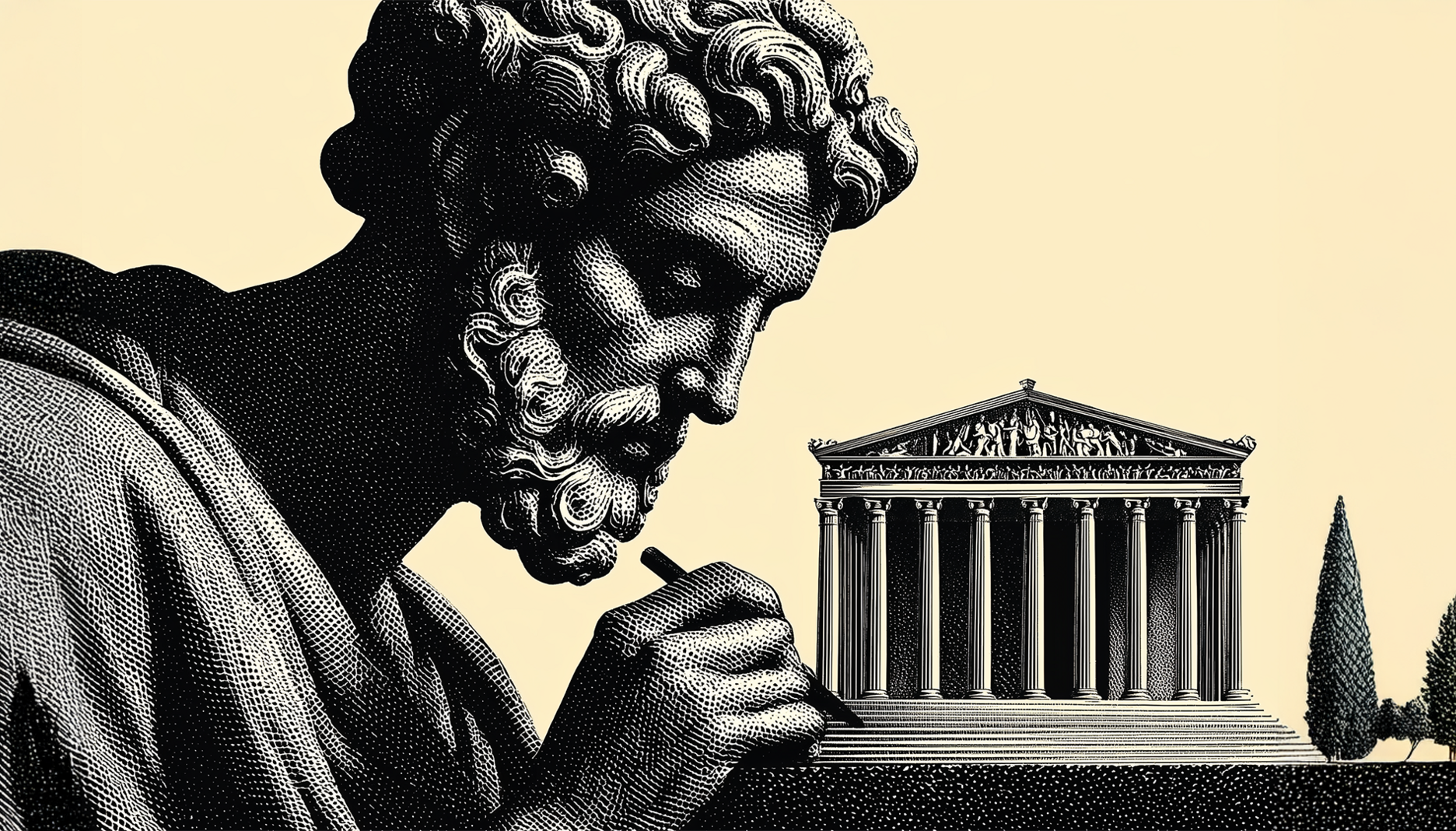
That is the job of art direction. It defines a feeling—and protects it—as the project progresses through technical decisions, sprints, and performance work. Where graphic design solves problems at the level of a single asset—a logo or layout—and product design solves problems at the level of interactions, art direction operates one tier higher. It shapes the overall look, feel, and atmosphere so that every visual choice communicates the same idea. It’s the visual north star—the mood, tone, and narrative that tie individual assets and interactions into a coherent whole.
Design is about what you make. Art direction is about how it all fits together—and, ultimately, what it makes people feel.
Making the room livable
Become a paid subscriber to Every to unlock this piece and learn about:
- Defining feeling, not features
- Why atmosphere requires a technical commitment
- How every surface is part of the product experience


What is included in a subscription?
Daily insights from AI pioneers + early access to powerful AI tools
 Front-row access to the future of AI
 In-depth reviews of new models on release day
Playbooks and guides for putting AI to work
Prompts and use cases for builders
In-depth reviews of new models on release day
Playbooks and guides for putting AI to work
Prompts and use cases for builders
 Bundle of AI software